
Navigation Redesign
EIS UX Team
Simplifying and Modernizing the Aviate ERP Navigation
Redesigning the Navigation
How can we design a Navigation that improves usability, creates dimension and is more scalable?
Role:
UX Designer
Team:
EIS UX
Tools:
Figma
Project Description:
Redesign and modernize the Aviate ERP’s navigation. This project focused on improving clarity, contrast, consistency, and functional efficiency.
Discovery
During initial discovery, our UX team met with users to understand their navigation pain points and gather feedback on workflow needs:
The existing navigation visually blended into the white interface, making it difficult for users to distinguish the menu from the workspace.
Iconography was inconsistent and not reflective of module meaning.
Module names lacked standardization, making scanning more difficult.
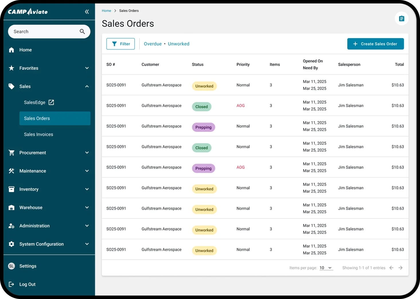
Final Design
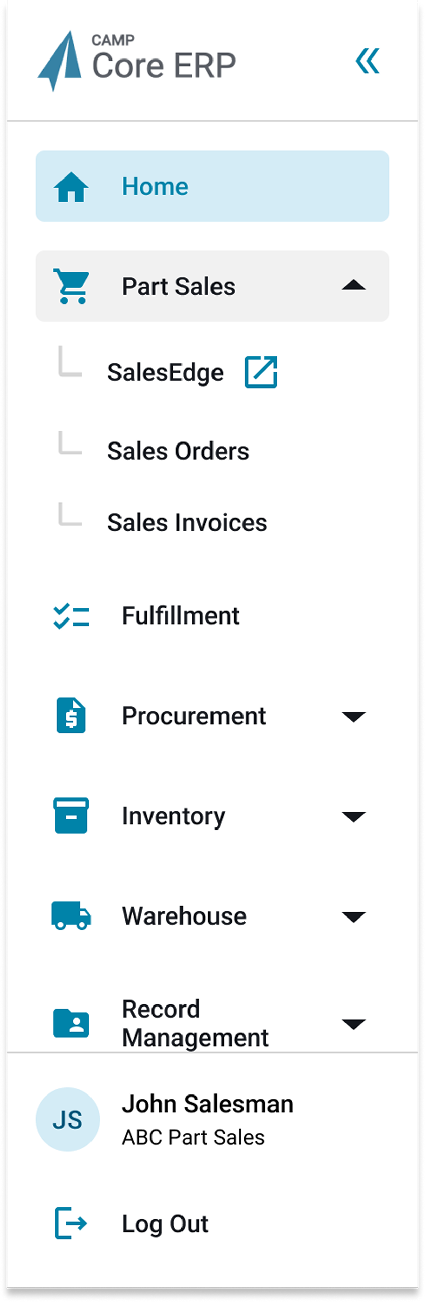
Current:

New:
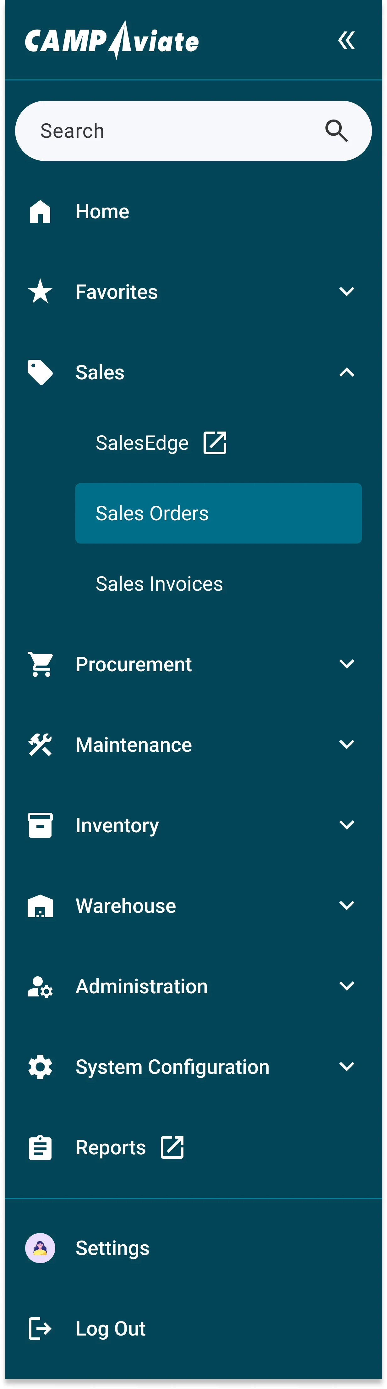
Wider navigation
Simplified and standardized module names
Updated icons
Dark theme to improve contrast
Search bar
The ability to favorite modules