
DoiT International UX Team
DoiT Help Center
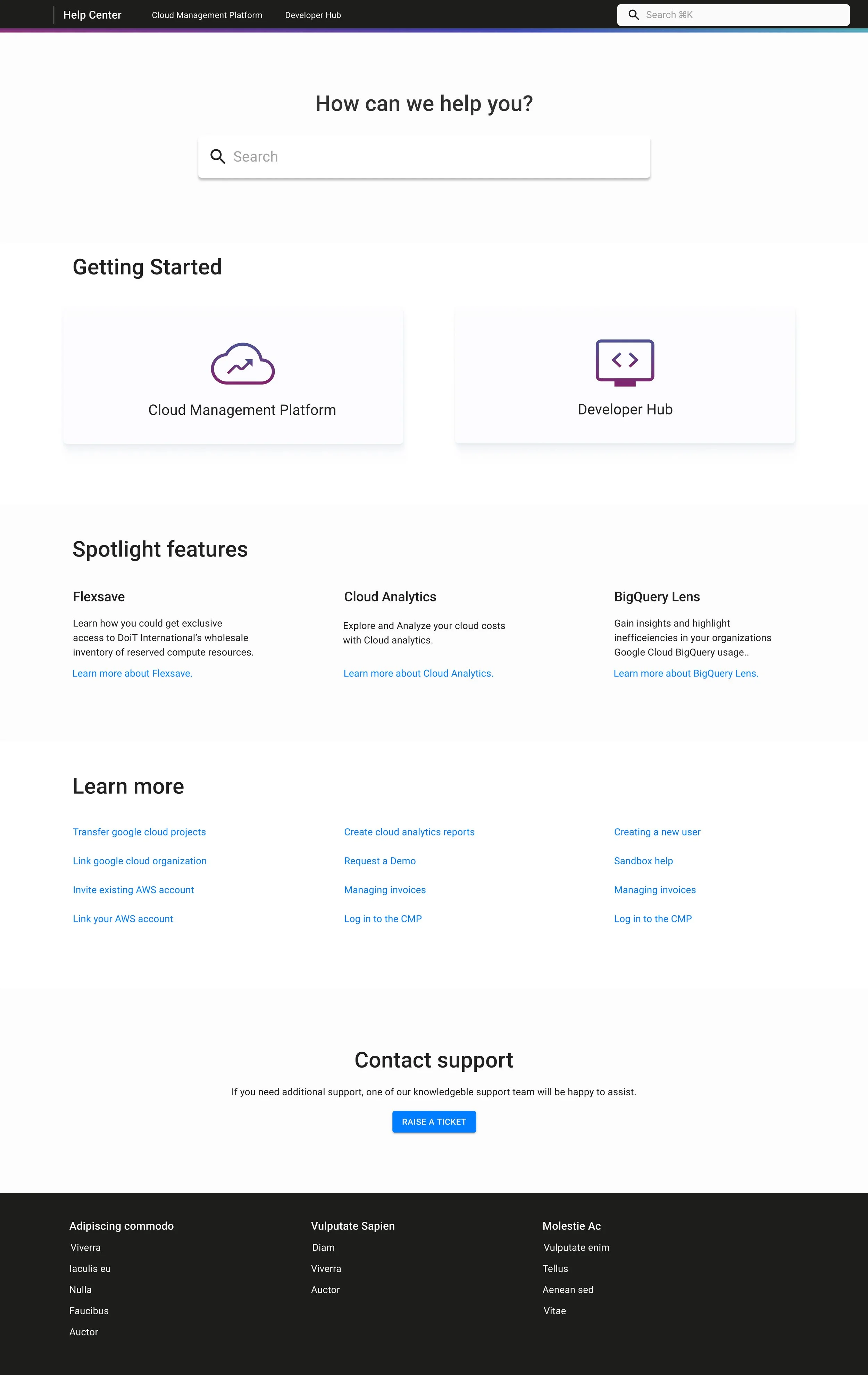
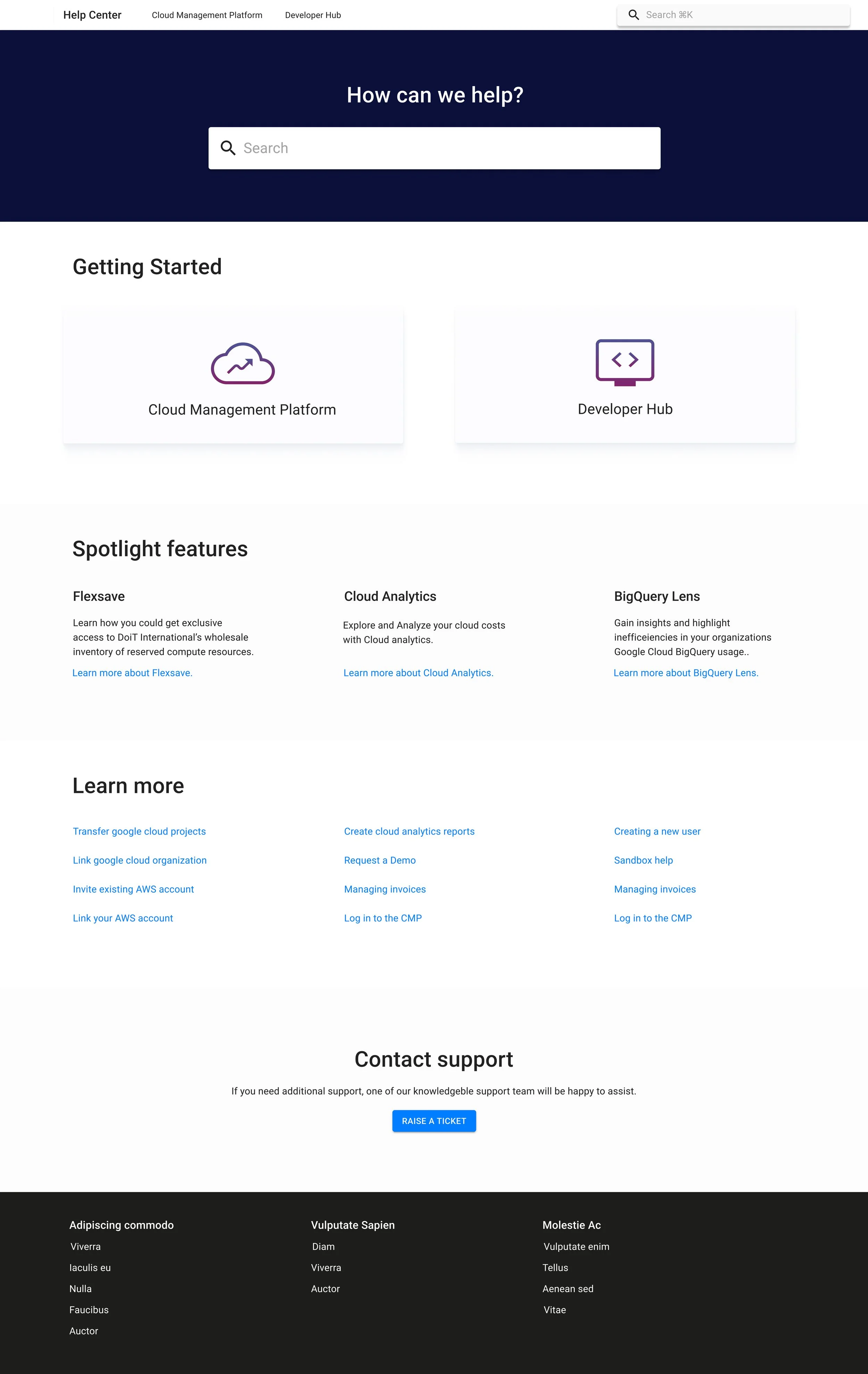
Creating the Help Documentation home page for DoiT International.
Creating the DoiT Help Page
How can we create a help landing page that improves task completion, and reduces support-ticket volume?
Role:
UX Designer
Team:
DoiT International UX Team
Tools:
Figma
Project Description:
As apart of a company rebrand DoiT International switched platforms for their help center. This project focused on redesigning the help center migrating content to a new platform while improving information architecture, usability, and visual consistency.
Discovery
Audit & Research
User interviews with customers, cloud engineers, and developers.
Analytics review of previous help-center.
Support ticket clustering to identify common topics.
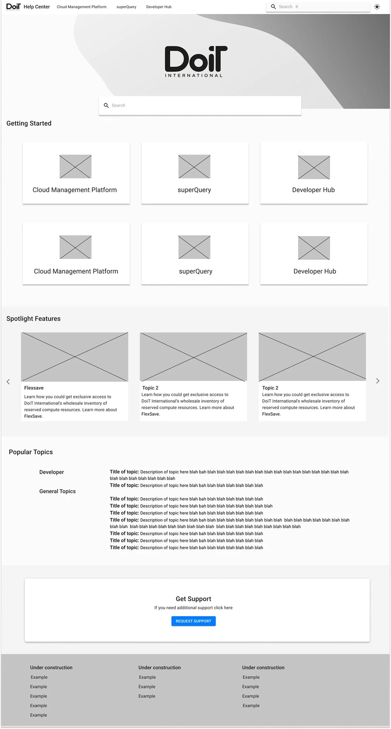
Information Architecture
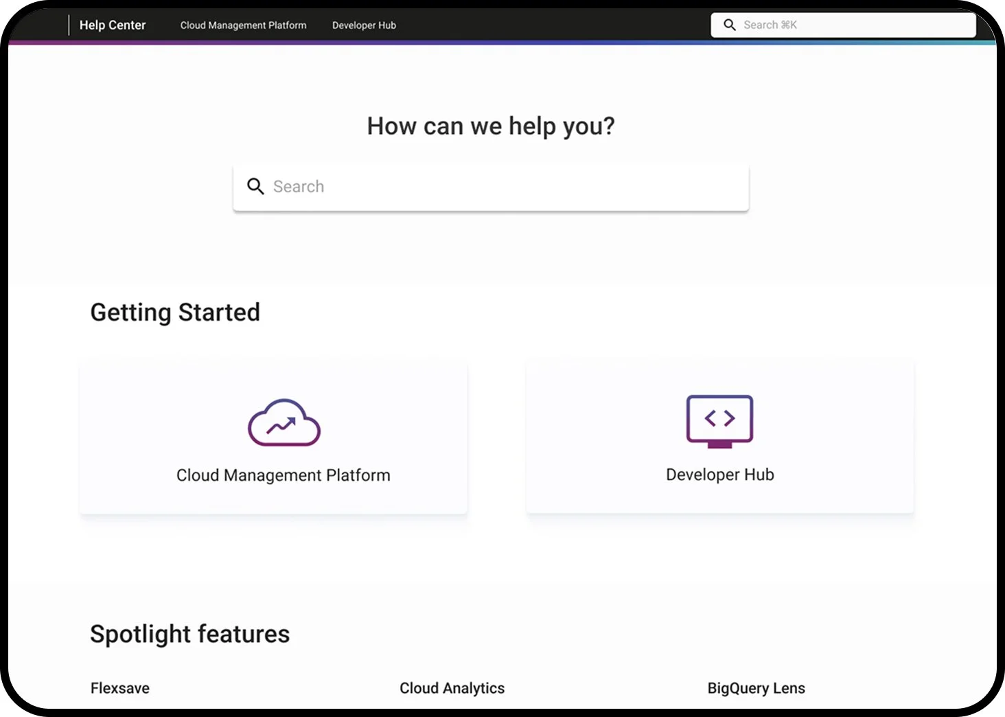
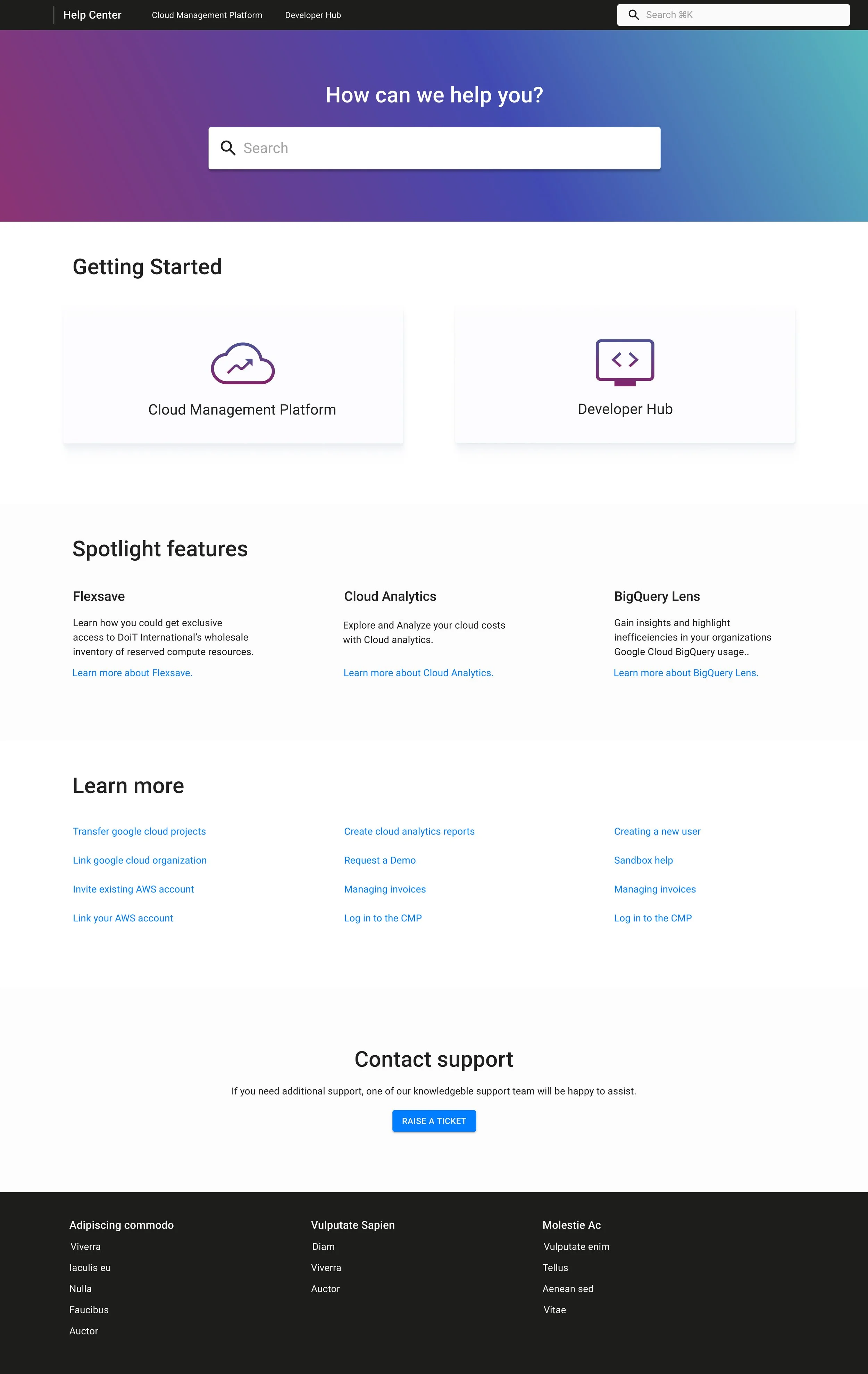
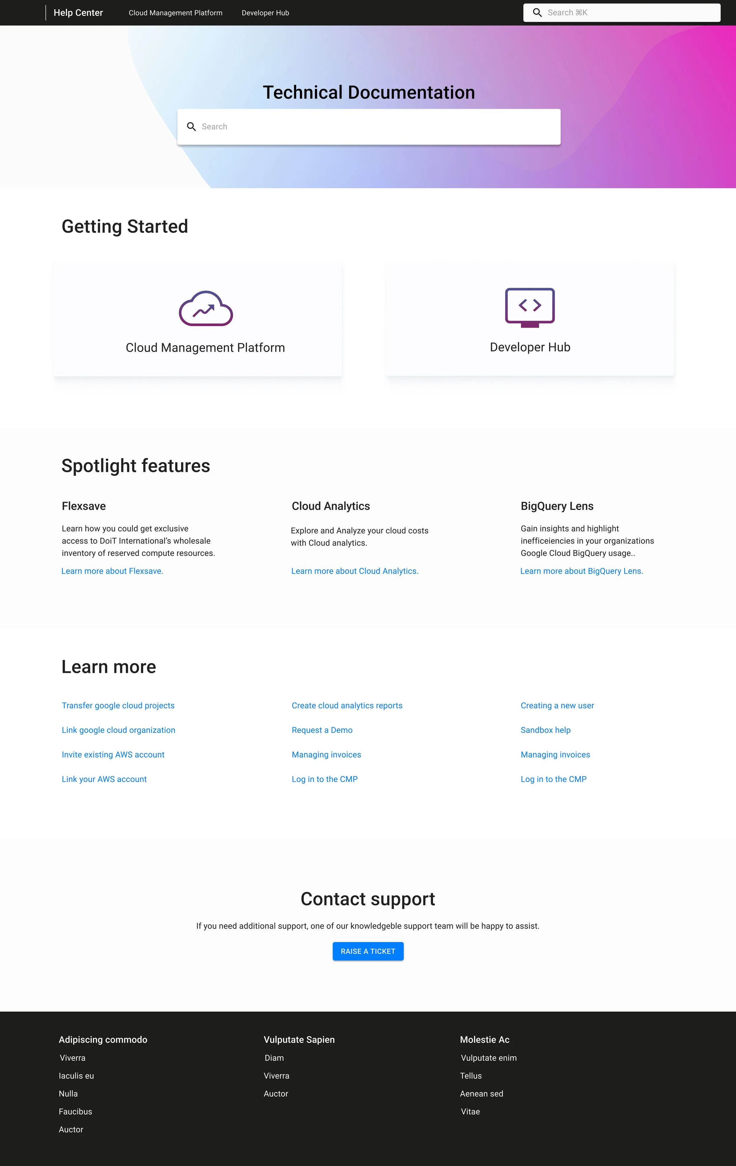
Primary Sections
Getting Started — onboarding and foundational learning.
Spotlight Features — high-value, complex tools requiring deeper explanation.
Learn More — a library of popular resources grouped by task.
Contact Support — accessible, but intentionally placed after self-service content.
Design
Brand Alignment
DoiT had just rebranded with new colors so it was a perfect space to play around with colors and have fun with the branding
Clean and minimal aesthetic reflects the products cloud management brand
Hierarchy and Scalability
Consistent use of spacing to divide sections
Card components for high-level choices
Contact Support button clear and easily available
Outcome & Impact
Business Impact
After the launch the Help Center helped customers with a faster time to problem resolution
The structure made it easier for internal teams to add new products and documentation without redesigning the experience
Increased engagement with optimization tools with the spotlight features